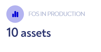
¶ KPI value
This widget displays the real-time value of a KPI. When you click on the number (on a computer ) or long press on it (on a smartphone
), you'll see a Pop-up Map which shows the list and location of the assets concerned.
¶ KPI evolution
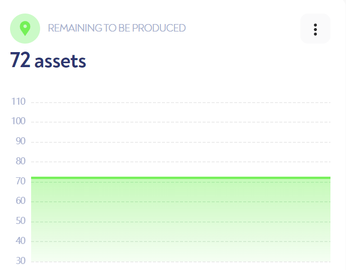
This widget displays the current value of the selected KPI and its evolution over the configured time range. When you click on the number (on a computer ) or long press on it (on a smartphone
), you'll see a Pop-up Map which shows the list and location of the assets concerned.
You can change the time range to be displayed by clicking on the calendar-shaped button at the top right of the KPI, then selecting the time range of your choice.
¶ Evolution of stacked KPIs
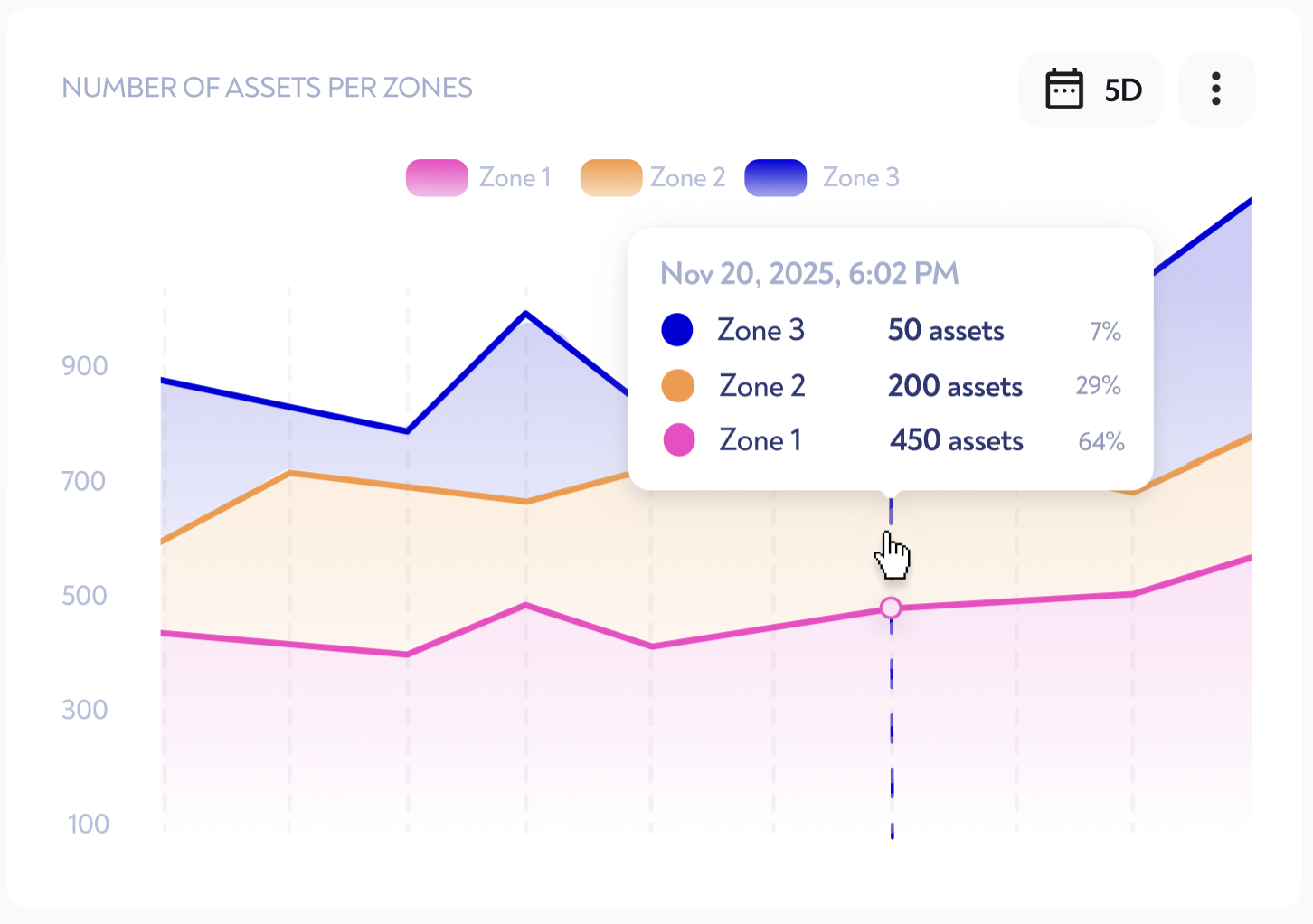
This widget shows the cumulative evolution of this KPI over time along a defined axis.
You can change the time range to be displayed by clicking on the calendar-shaped button at the top right of the KPI, then selecting the time range of your choice.
You can show or hide certain curves by clicking on their name in the legend.
You can also display just one by using the search function (click on the magnifying glass and search for the curve you wish to display).
Please note: the search bar is only visible on widgets that are large enough.
¶ Pie chart
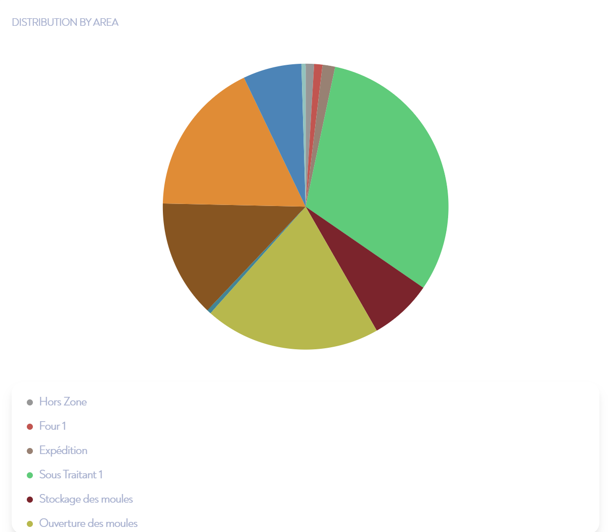
The pie chart widget displays KPI values broken down according to the criteria you've defined. When you hover (on a computer:) or tap (on a smartphone ) on a pie section, a tooltip appears with the KPI value for that section and the associated percentage.
When you click on a slice of the pie (on a computer ) or if you long-press it (on a smartphone
), you'll see a Pop-up Map which shows the list and location of the assets concerned.
You can show or hide certain shares by clicking on their name in the legend.
You can also display just one by using the search function (click on the magnifying glass and search for the curve you wish to display).
Please note: the search bar is only visible on widgets that are large enough.
¶ Histogram
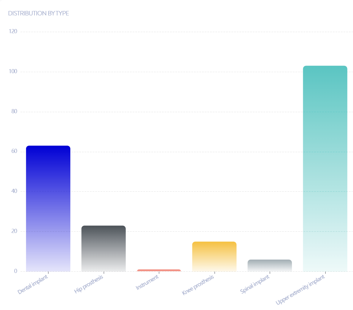
A histogram widget is a graph that displays assets distributed according to the criteria of your choice. When hovering (on computer:) or tapping (on smartphone ) on a histogram section, an info-bull appears with the KPI value for that section and the associated percentage.
When you click on a histogram bar (on a computer ) or long-press it (on a smartphone
), you'll see a Pop-up Map which shows the list and location of the assets concerned.
¶ Stacked histogram
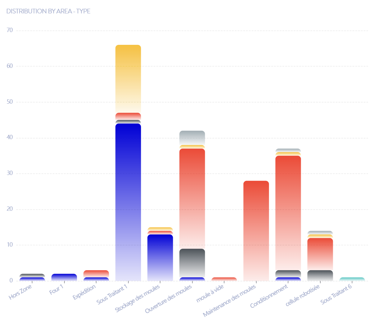
A stacked histogram is a type of graph that presents several series of data in the form of bars stacked on top of each other. The data is then spread over two properties of your choice, one on the x-axis and one on the y-axis, forming stacked bars.
Here's how to read and interpret a stacked histogram:
-
Horizontal axis (X) : The horizontal axis represents a first distribution on a property (e.g. zone or state)
-
Vertical axis (Y) : The vertical axis represents the total value (which can be a number of assets, or a sum or average of values).
-
Stacked segments : Each bar is divided into colored segments, in which we find the values corresponding to the intersection of two properties: for example, the number of assets in zone A and state X, or the sum of asset weights in zone A and state X.
-
Reading values : To determine the individual contribution of a colored segment to the x-axis property, simply read the height of the colored segment.
When hovering (on computer:) or tapping (on smartphone ) on a segment of a bar, a tooltip appears with the KPI value on that segment of a bar and the associated percentage (relative to the bar).
When you click on a segment of a histogram bar (on a computer ) or long-press it (on a smartphone
), you'll see a Pop-up Map which shows the list and location of the assets concerned (corresponding to the two properties).
You can show or hide certain segments by clicking on their name in the legend.
You can also display only a segment or a bar using the search function (click on the magnifying glass and search for the curve you wish to display).
Please note: the search bar is only visible on widgets that are large enough.
¶ Pivot table
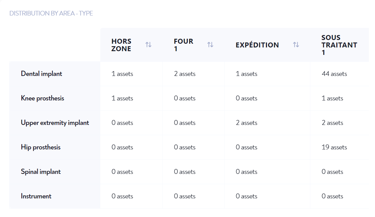
Since release 2024.2 you can export pivot table data. All explained here !
The intersections between rows and columns contain KPI values that respect both properties. For example, the number of assets in zone A (x-axis) and state X (y-axis)
When you click on a table cell (on a computer ) or if you long-press on it (on a smartphone
), you'll see a Pop-up Map which shows the list and location of the assets concerned (corresponding to the two categories).
You can display just one row or column using the search function (click on the magnifying glass and search for the curve you wish to display).
Please note: the search bar is only visible on widgets that are large enough.
¶ Gauge
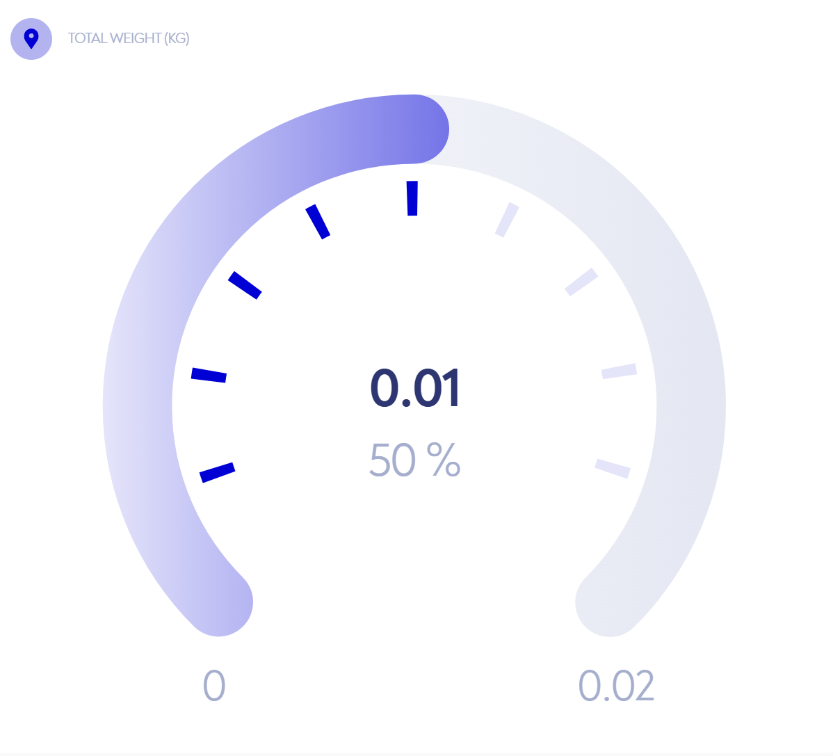
This widget shows the value and position of the selected KPI in relation to the configured maximum and minimum values.
When you click on the number (on a computer ) or long press on it (on a smartphone
), you'll see a Pop-up Map which shows the list and location of the assets concerned.
Is this page unclear or do you need help? Don't hesitate to contact us at support@zozio.tech !